Adobe
Brand System
SUMMARY
Adobe has a over 100 interconnected products and services. As the company shifted from perpetual licenses to cloud-based subscriptions, there was a need to unify the look and feel of Adobe’s brand, telling a story about cohesive ecosystem.
THE CHALLENGE
Adobe has a massive product line with a wide array of stakeholders. In addition to creating the look and feel of the brand, my team also produced and oversaw implementation of thousands of individual assets.
Role
Design Lead
SKILLS
Design Strategy
Brand Design
User Experience
Visual Design
Production Design
Art Direction
Previous System
Adobe’s previous brand system suffered from inconsistencies, a lack of hierarchy, and poor contrast on some of the app icons. While Adobe was known for the two letter mnemonics, many products were unrecognizable as part of Adobe’s system. There was an opportunity to create an own-able look and feel.
Explorations
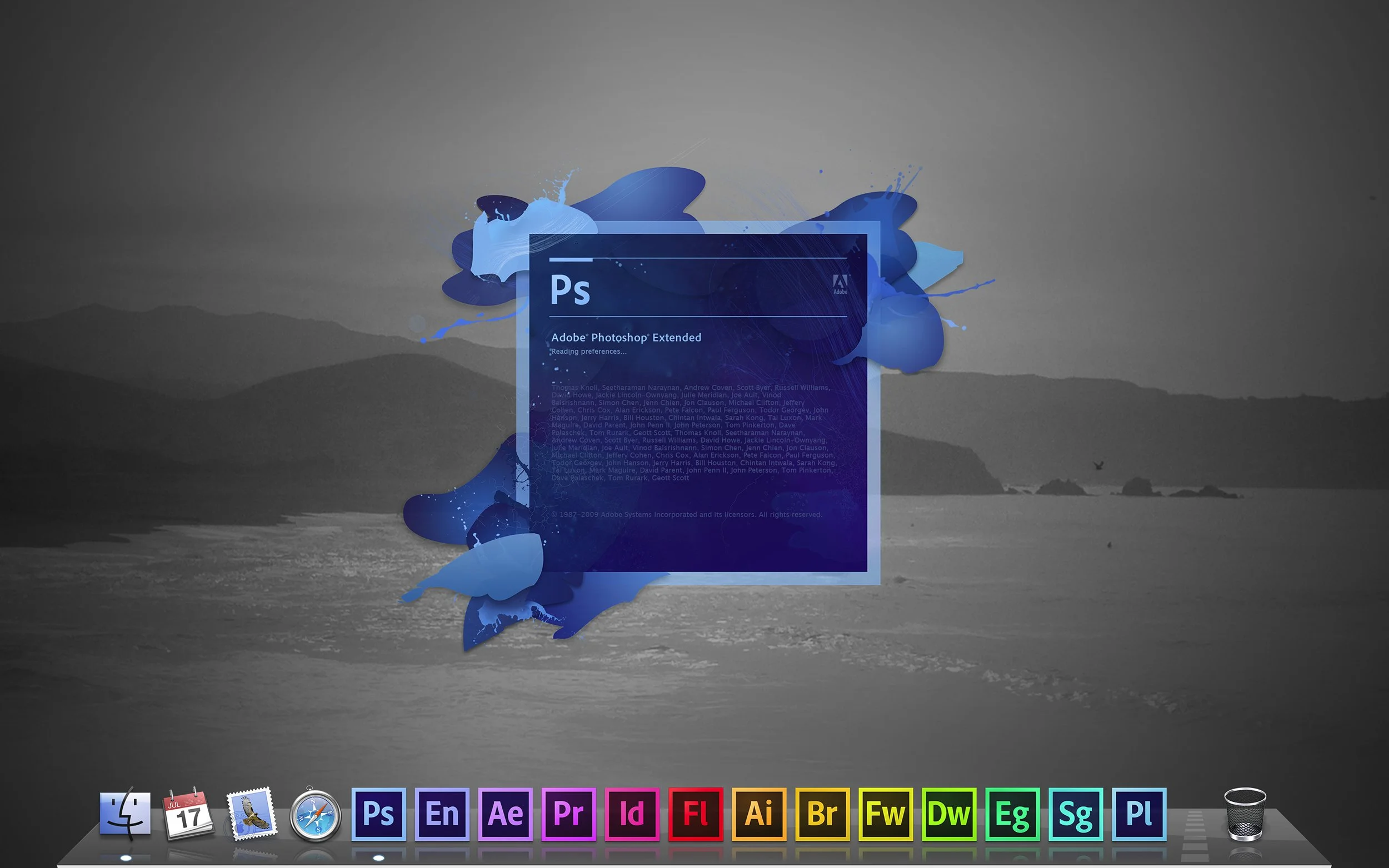
Extensive explorations were done to find a color scheme that could be cohesive, scale across all of Adobe’s products, and stand out in all contexts. Splash screens and secondary design elements could expand on the brand language and help convey the creativity of our community.
Final Design
The new system was first made for Adobe’s creative tools. It featured a high contrast color spectrum that stood out on the desktop and made the products feel more cohesive. The shape of the splash screens connected to the app icons, with details that referenced each individual product and provided organic contrast to the square geometric shapes.
Production and Implementation
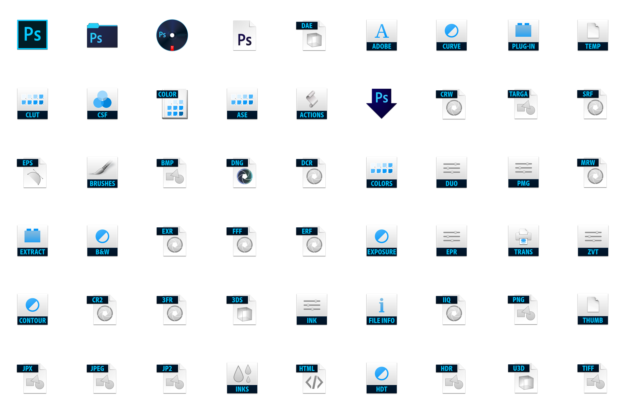
There are thousands of branded assets in Adobe’s products. For example, Photoshop alone has over 100 branded icons. Each one is produced at seven different sizes for MacOS and Windows. To handle this, custom tools were made to help automate some of the production. Processes were created to organize and distribute assets, and there was a close partnership with engineering to ensure they were implemented correctly.
New Products
Adobe’s product line is continually evolving. A whole set of creative mobile apps was launched, the line of Acrobat products was expanded, and new business line was created for marketers. A flexible system was needed to accommodate this change and any change yet to come. Creative Cloud and Experience Cloud sub brands were created to add structure. A look and feel was created for each segment, but they were designed to all look cohesive together.
Ongoing Updates
Adobe’s brand system required continual maintenance, both to accommodate a changing product line and to keep certain elements fresh. One example of this is on the splash screens. They were changed to feature artwork from Adobe’s community and updated regularly to highlight wonderful work being done with Adobe’s products.


